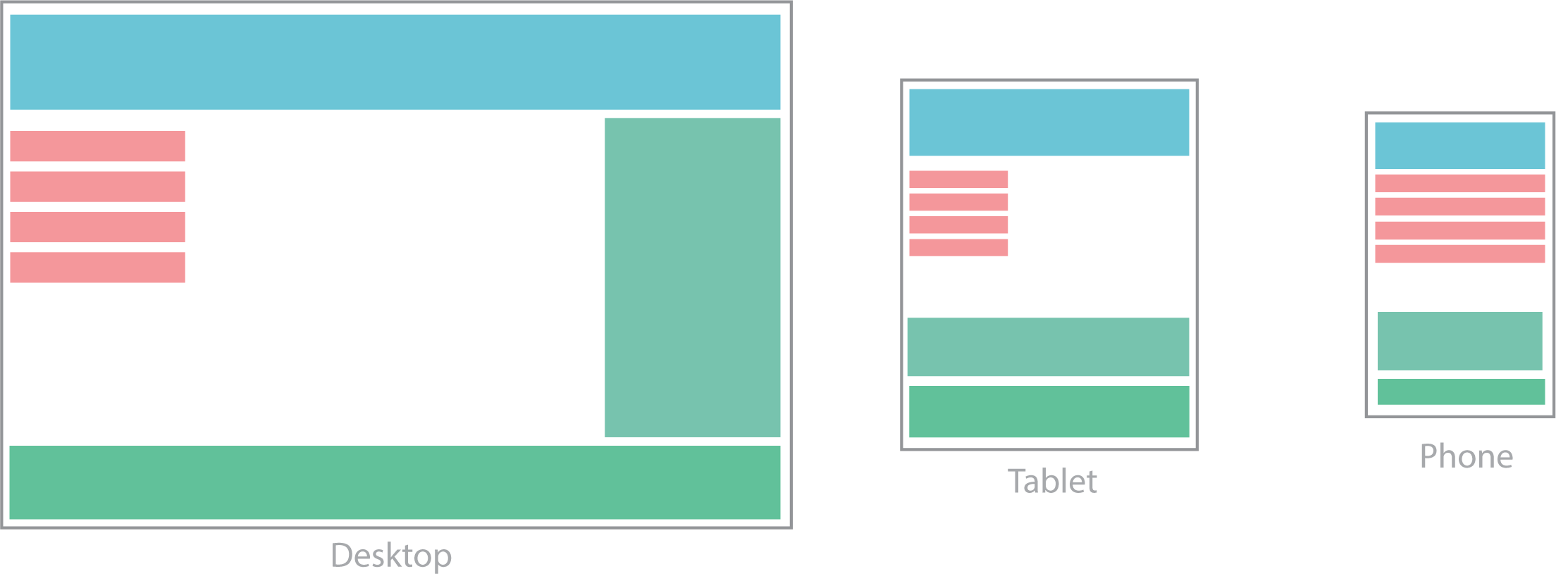
Breakpoints
A breakpoint determines the point at which the layout will adapt to the size of a device or viewport.
Mobile-First
Bootstrap 5 is a mobile-first framework. That means it is made to be viewed on movile devices first. This helps webpages load faster on smaller devices.

Available Breakpoints
There are 6 different breakpoints included in Bootstrap 5. These are referred to as grid tiers.
| Breakpoint | Class infix | Dimensions |
|---|---|---|
| X-Small | None | <576px |
| Small | sm |
≥576px |
| Medium | md |
≥768px |
| Large | lg |
≥992px |
| Extra large | xl |
≥1200px |
| Extra extra large | xxl |
≥1400px |
Table via https://getbootstrap.com. Click the button to learn more about breakpoints.